TrendSpy Brand Guidelines
Visual identity, typography, color, and voice for a data-driven trend analysis platform.
Purpose + Positioning
TrendSpy helps organizations spot emerging patterns before they go mainstream. The design language balances analytical precision with accessible visualization.
Promise
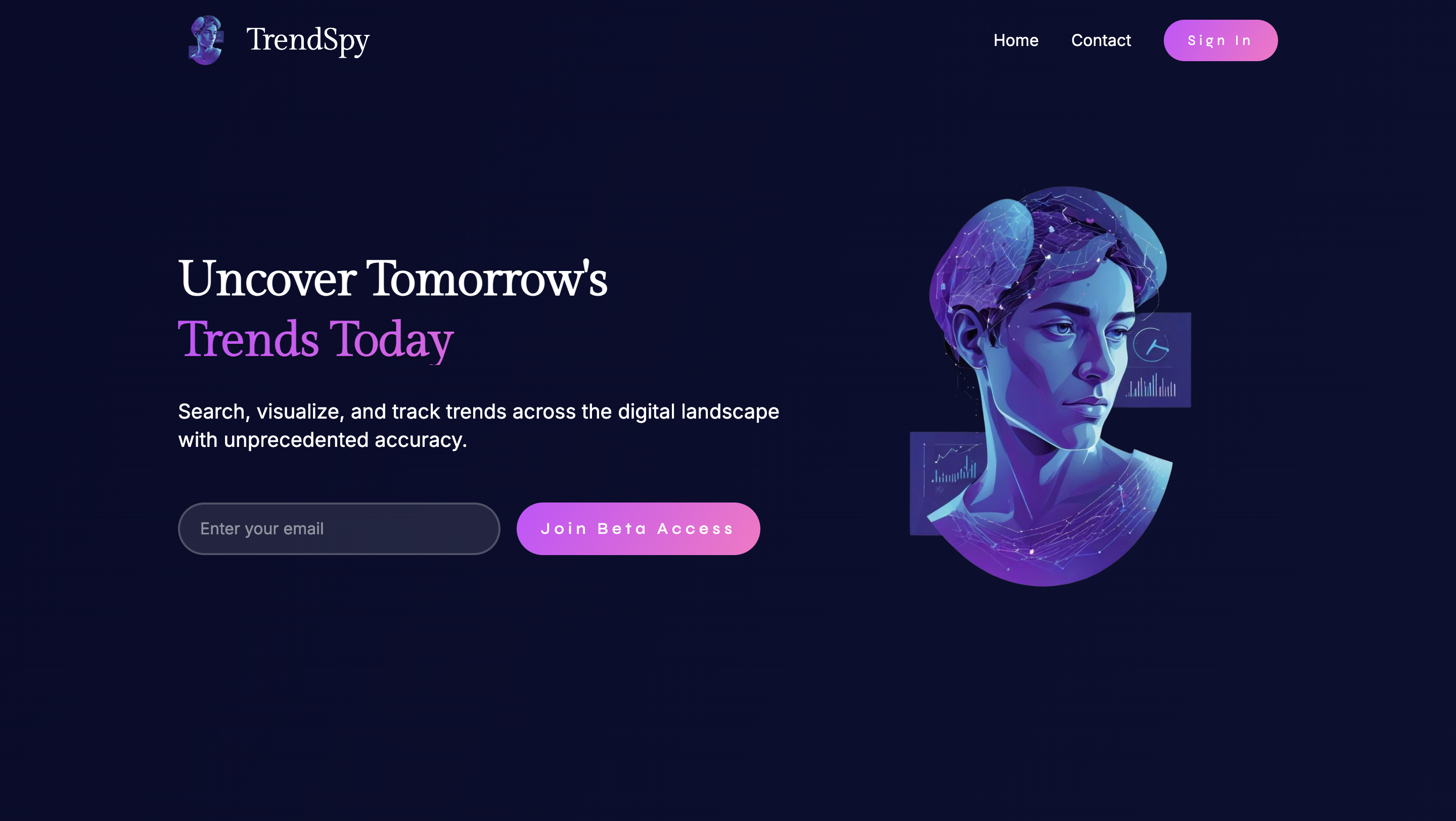
Uncover tomorrow's trends today. Data-driven insights that inform better business decisions through real-time monitoring and advanced analytics.
Personality
Forward-thinking. Data-driven. Insightful. Accessible. We reveal patterns others miss and make complex data understandable.
Logo System
Stylized human profile with integrated data visualization elements. Gradient blues and purples with network patterns and charts overlaid - the fusion of human intelligence with data analytics.

Clear Space
Minimum clear space equals the height of the emblem on all sides.
Minimum sizes: Primary 120px / Emblem 80px (digital). Primary 1.5in / Emblem 1in (print).
Usage
- Keep original colors and proportions
- Use on backgrounds with sufficient contrast
- Maintain clear space around the logo
- Stretch, rotate, or distort
- Change colors outside approved palette
- Place on busy or low-contrast backgrounds
Color System
Deep navy background for contrast. Vibrant purple accents for brand recognition. Designed for extended data analysis sessions without eye strain.
Primary
Secondary + Status
All primary text combinations meet WCAG 2.1 AA contrast standards. White on Deep Navy: 17.6:1. White on Purple: 4.7:1.
Typography
Three typefaces, each with a clear job. Serif for authority, sans-serif for readability, geometric for action.
Gilda Display
Elegant serif for headings and feature highlights. Adds sophistication and contrast against the clean body text.
Inter
Body copy, UI elements, navigation. Optimized for readability across devices.
Syne
Buttons and CTAs only. Wide letter spacing sets interactive elements apart from content.
Voice + Tone
Confident and forward-thinking, but never stuffy. We turn complex data into clear, actionable insights.
Characteristics
Confident. Forward-looking. Clear. Precise. Helpful. We speak with authority from data, focus on what's coming, and translate complexity into actionable insight.
Adjusts to Context
Educational content is patient. Product features are direct. Alerts are concise. Success messages celebrate. The voice stays consistent, the tone flexes.
"Real-time trend tracking identifies emerging patterns across social media, news, and forums, giving you up to a 3-week advantage."
"We've detected an unusual spike in your tracked keywords. View the analysis to see what's driving it."
"Our amazing, cutting-edge, revolutionary trend tracking system is proven to be the best in the world!"
"Alert: Keyword spike detected in system parameters across multiple data channels in correlation with temporal anomalies."
Brand Application
Consistent identity across web and mobile, adapted for each platform's constraints.
Web
Mobile

Process + Impact
Research
Competitive audit of the trend analysis market. Identified visual differentiation opportunities.
Foundation
Defined brand promise, personality, and positioning before any visual work.
System
Built the visual identity: emblem, color palette, typography, and component library.
Implementation
Extended the brand across web and mobile, evaluated for consistency at each touchpoint.